Hi Friends,
It’s Rebecca here on the blog today, sharing my latest layout created with the stunning Wanderlust Explorer collection from Dennis Bruton. Masculine-themed collections aren’t something I come across often, so I was thrilled to see this one. It features bold, masculine colours, yet still incorporates just the right amount of florals, making it perfectly balanced and incredibly versatile!

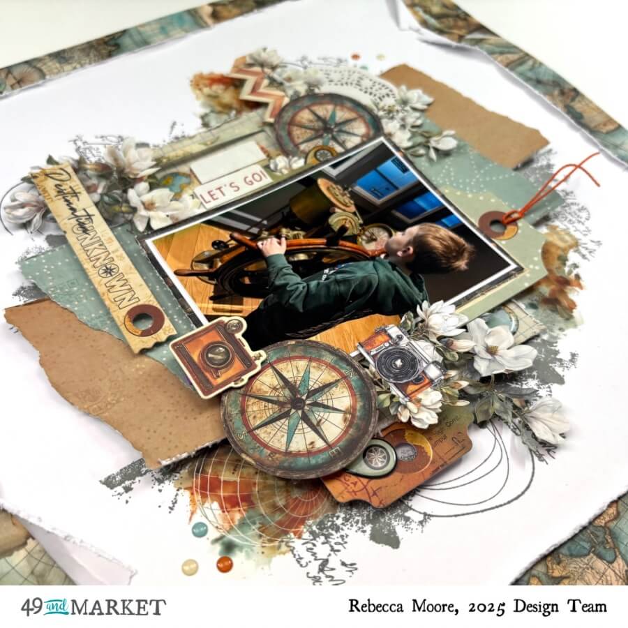
As I was going through some recent photos, I stumbled upon this one of my son at the Titanic Museum. I couldn’t help but notice how well the colours of the photo matched the collection! I started by cutting strips from two patterned papers, then tore the top and bottom edges for added dimension. I arranged the strips vertically in the center of a sheet of white cardstock, then added a third strip from the Solids collection horizontally behind them for extra contrast.
On top of these layers, I placed my photo, which I mounted on a darker patterned paper from the 6×8 pad. This added contrast and helped the photo pop. Behind the photo, I tucked in a tag and a journal card from the Die Cut Elements.
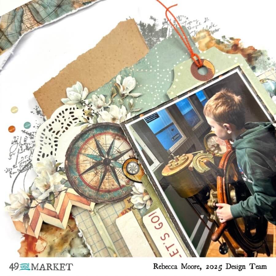
With the larger elements in place, it was time to embellish. Once again, I was spoiled for choice with all the beautiful elements in the collection! I selected a few decorative compasses, cameras, and florals from the Laser Cut Elements, and arranged them around my photo. I just love how detailed the laser cuts are in 49 and Market collections. They always coordinate perfectly with the papers and add such an intricate touch.

I typically prefer larger titles and usually reach for the Chipboard Words, but for this layout, I decided to go with a smaller banner from the Die Cut Elements pack. I positioned it neatly underneath my photo, creating a more subtle effect.

The layout was coming together beautifully, but I felt the outer edge needed a frame. So, I trimmed my white cardstock to approximately 10×10 inches and mounted it on the Explorer Diaries patterned paper. I chose this paper because it was darker, providing a nice contrast to the white background, and it incorporated all the colors I’d used in the main design of the layout.
To finish it off, I added some stamping to the background using Sizzix and 49 and Market stamps. I stamped some black images along the edges of the central design, then completed it with a few gorgeous Rub-On Transfers and a few Epoxy Stickers.
49 and Market products:
- Wanderlust Explorer – 49 and Market
- Wanderlust Explorer – 12 x12 Solids Collection Pack – 49 and Market
- Wanderlust Explorer – 6 x 8 Collection Pack – 49 and Market
- Wanderlust Explorer Laser Cut Element Set – 49 and Market
- Wanderlust Explorer Die-cut Elements – 49 and Market
- Wanderlust Explorer Chipboard Words – 49 and Market
- Wanderlust Explorer 6×12 Rub-on Transfer Set – 49 and Market
- Wanderlust Explorer Epoxy Stickers – 49 and Market
- Layered Clear Stamps Set 3PK – Artsy Regal Frame by 49 and Market – Sizzix.com
- A5 Clear Stamps 23PK w/5PK Framelits Die – Bird Song by 49 and Market – Sizzix.com
- A5 Clear Stamps 5PK w/6PK Framelits – Build-a-Burst | Painterly by 49 and Market – Sizzix.com
Thanks so much for stopping by today!
I absolutely love this collection, and I’m sure you’ll be seeing more of it from me soon.
I can’t wait to see the beautiful creations everyone else makes with it.
Take care,
Rebecca xx