Hello everyone,
It’s Claire here and today I’m sharing my first layout with you, created with the stunning new Wherever collection!
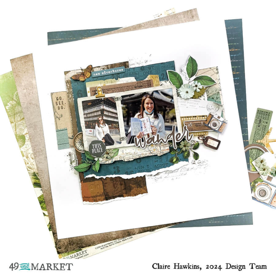
I started with a piece of Essential White Cardstock as my base and wanted to create a dimensional layout to document a trip we took to Japan last February.
Using patterned papers from the 12×12 Collection Pack I cut four different pieces, choosing the blue and brown patterns to echo the colours in my photographs.
The papers are sized approximately 10”x 3.3”, 8” x 4” and 6.5” x 6.5”.
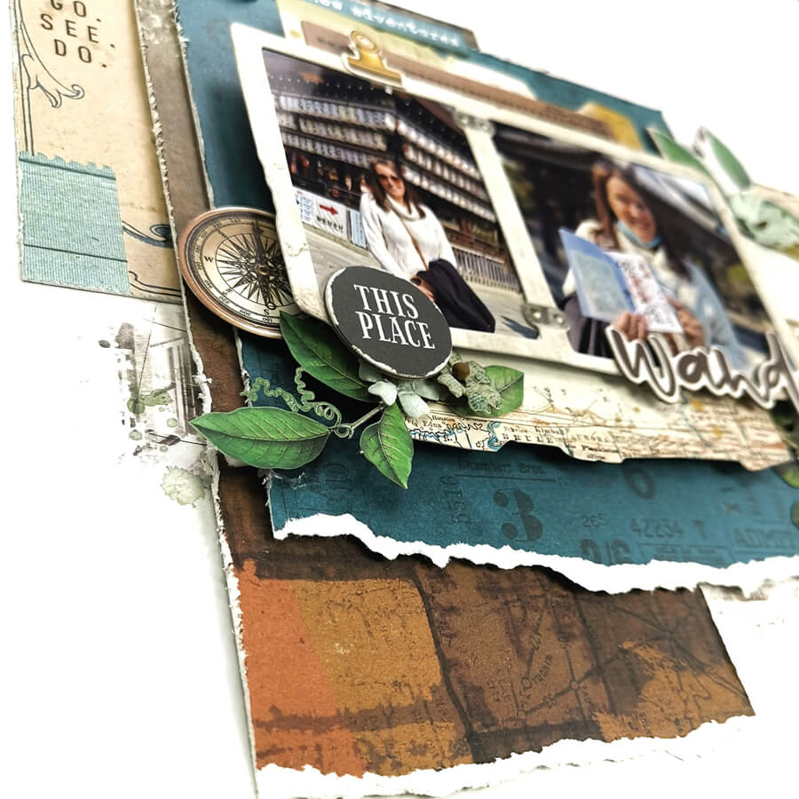
To create texture, I distressed the edges of each piece and tore the larger two pieces along the bottom to give a white edge. I adhered the bottom paper directly to the page, raising the other two pieces on foam to create extra dimension.
Next, I took a large map piece and brown ticket from the Wherever Ephemera Bits, along with that beautiful double frame which I used to house my photos. I layered the map and ticket behind my pictures, again raising on foam for dimension.
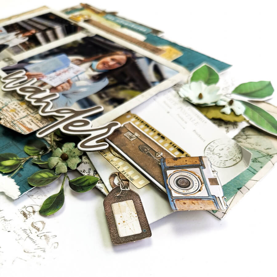
To the right of the photo, I wanted to create a large cluster, so I layered another piece of patterned paper that looked like newspaper print and used this as an anchor to build my cluster. It contains the small postcard from the Wherever Ephemera Bits, an acetate filmstrip, chipboard ephemera, a small luggage tag from the Mini Laser Cut Elements and some small florals.
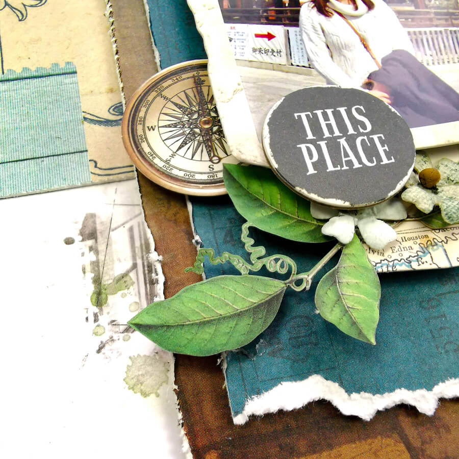
To balance the page, I added a smaller cluster on the opposite side of my photo, with Mini Laser Cut leaves, some Chipboard Bits and a compass from the Laser Cut Elements.
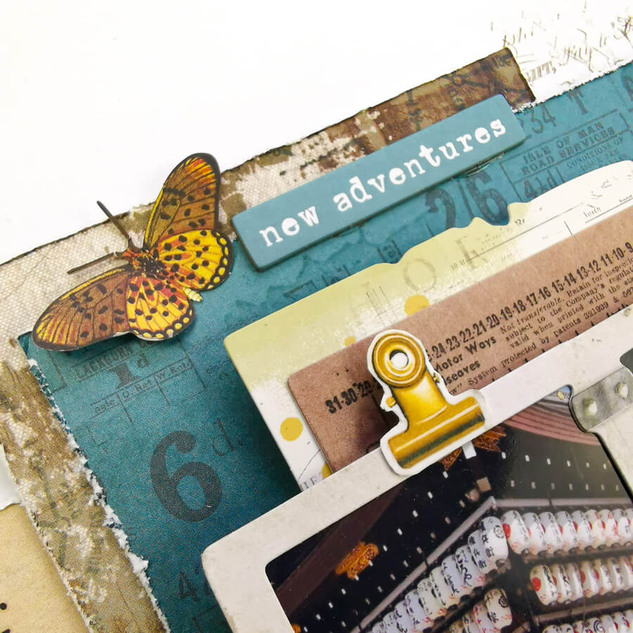
To the top of the design, I adhered a laser cut butterfly, glueing just along its body so the wings are free to lift, making it look as if it has landed on the layout. Alongside this I added one of the Chipboard Words saying “new adventures”. I felt this really matched my photo as it was our first ever trip to Japan.
I wanted to create the illusion that the tickets and photos were clipped together, so I took one of the clips from the washi tape and stuck it to plain white cardstock to give it more strength. Once it was fussy cut out, I adhered this directly to the photo frame. I love the extra pop of colour this brings to the page.
We had wandered around the area on foot and had stumbled upon a beautiful temple, so ‘Wander’ title from the Chipboard Words just had to be my title!
In the photograph, I had found a small office that creates hand drawn stamps, beautifully illustrated. To echo this writing on my layout, I added some rub-ons to the background that had an old-style script. I added a further rub-on to the bottom layer of the patterned paper saying Go. See. Do. This seemed very fitting for the story I was documenting.
49 and Market products:
- Essential White Cardstock – 49 and Market
- Wherever 12×12 Collection Pack – 49 and Market
- Wherever Mini Laser Cuts – 49 and Market
- Wherever Laser Cut Elements – 49 and Market
- Wherever Ephemera Bits – 49 and Market
- Wherever Chipboard Set – 49 and Market
- Wherever Chipboard Words – 49 and Market
- Wherever Acetate Assortment Set – 49 and Market
- Wherever Ride Rub-on Transfer Set – 49 and Market
- Wherever Washi Sticker Roll – 49 and Market
- Royal Posies – Ocean Jade – 49 and Market
I hope you’ve enjoyed this layout.
The Wherever collection is truly stunning and just perfect for your travel layouts.
I look forward to sharing some more layouts with you soon.
Until then, happy scrapping!
Claire x
