Hello,
I’m excited to be sharing a layout with you today using the Krafty Garden collection. This collection is beyond gorgeous! The colours, the patterns and florals are just exquisite and I couldn’t wait to dive in!
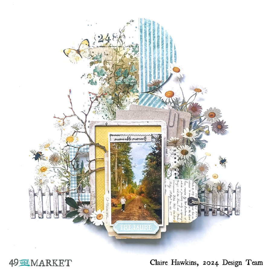
To me, it has a real spring, outdoor vibe and so I wanted to use it to document a walk through our local woods as the colours matched my photo so well.
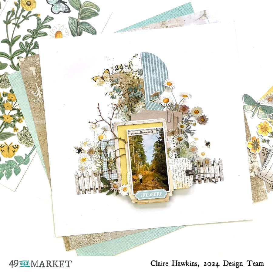
I started with a piece of white cardstock and matted my photograph using a frame from the Laser Cut Elements, and mounted a piece of yellow patterned paper from the Solids Pack into one of the exclusive chipboard frames from the Krafty Garden Collection Bundle.
I raised these on foam, and layered them on top of a tag and ephemera from the Ephemera Bits pack to add depth and dimension.
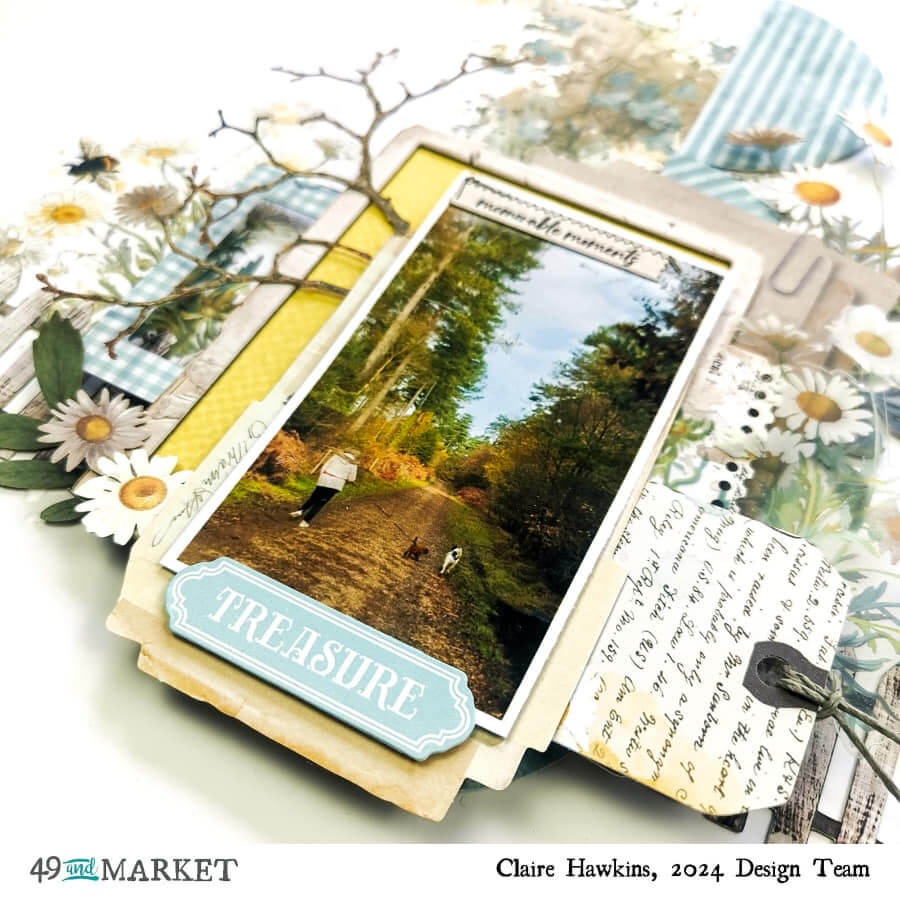
On top of this, I added my title, ‘Treasure’ taken from the Ephemera Bits, and a small subtitle ’memorable moments’ from the Laser Cut Elements.
To create a base for my cluster to sit on, I punched some 3” circles out of the Journal Cards paper included in the Collection Pack and arranged these vertically down the centre of my page. To the left of this, I added a large floral rub on from the Blendable Rub-On Transfer set which was perfect to pull all the colours together, I complemented this with a small yellow butterfly, this time form the Botanical Rub-On Transfer Set.
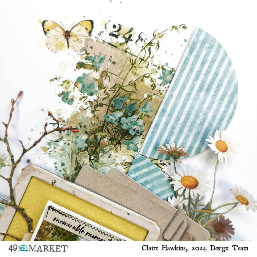
Next, I started to build the floral clusters. I layered Botantical Rub-Ons on the left and used the equivalent Wildflower Laser Cut on the right, adding some acetate florals from the Acetate Assortment pack on top of this to create movement and depth.
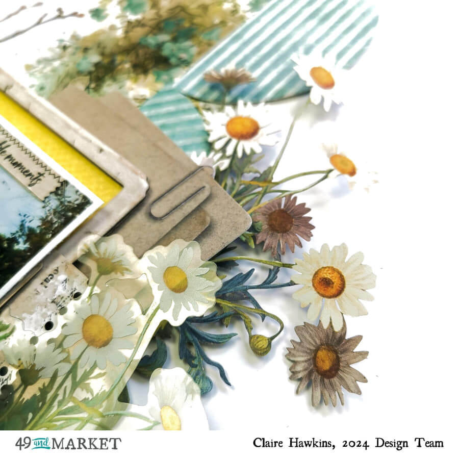
To the left cluster, I also added a small blue frame from the Ephemera Bits and a large branch from the Laser Cut Elements. I love the effect this gave – it really helped to convey the feel of the woodlands in my photograph.

To give my page an anchor, I user the Fence in the Laser Cut Elements to balance the bottom of the design. By cutting it in half, I was able to insert each section at either side of my photo without disturbing the design. I also added a few small flowers and leaves to help frame the photo.
As a final touch, I added two bees from the Botanical Rub On Transfers, one on either side of the design, and with that, the page was complete.
49 and Market products:
- Essential White Cardstock – 49 and Market
- Krafty Garden Collection Bundle with 12×12 chipboard – 49 and Market
- Krafty Garden Wildflower Laser Cuts – 49 and Market
- Krafty Garden Ephemera Bits – 49 and Market
- Krafty Garden Acetate Assortment Set – 49 and Market
- Krafty Garden Botanicals Rub-on Transfer Set – 49 and Market
I hope you’ve enjoyed this blog – I certainly enjoyed making it and can’t wait to come back soon with more!
Claire xx

WOW! All that luscious layering. Beautiful!
How absolutely stunning! What an inspirational page. Thank you.