Hello everyone,
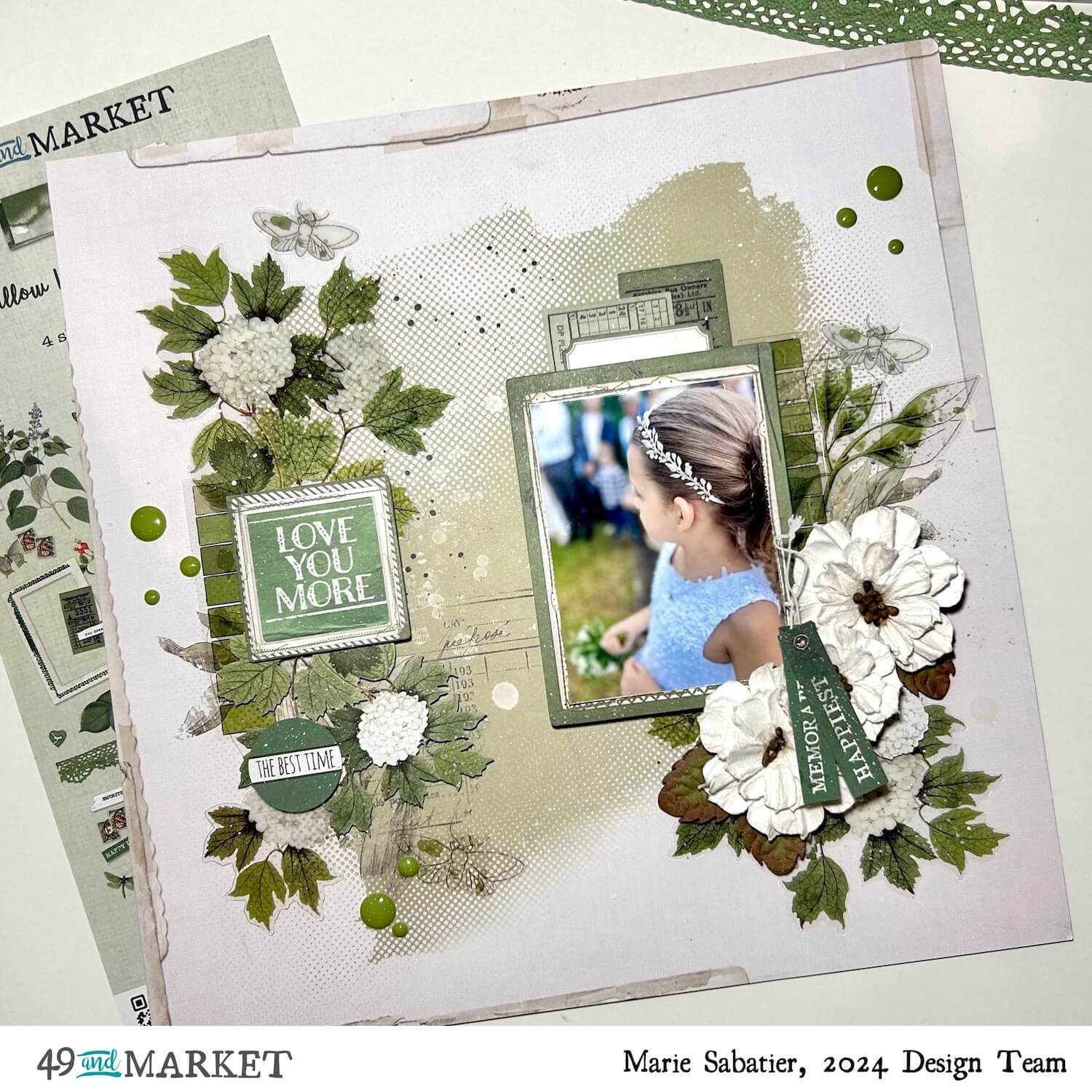
It is time for me to present my new inspiration for June using the products of the green collection ” color-swatch-series-willow “. For this, I chose a photo of my granddaughter taken recently at the wedding of my youngest son.

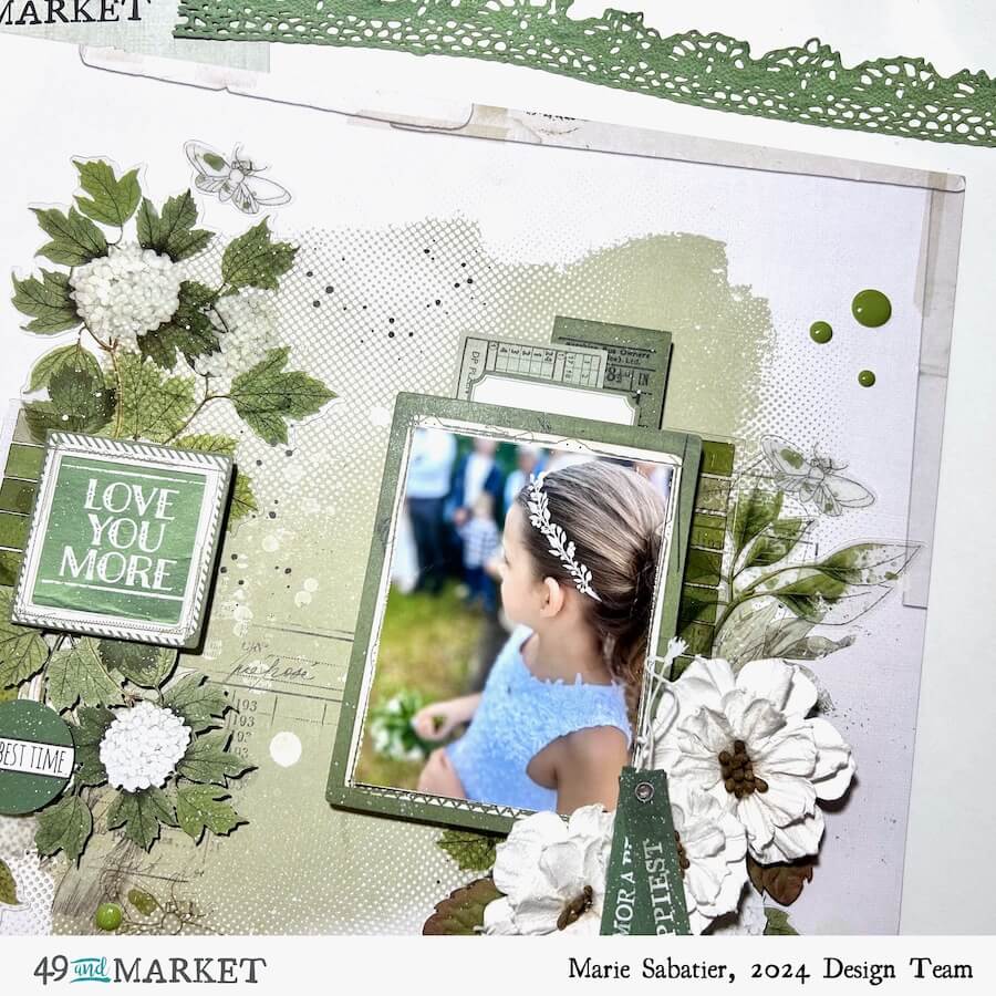
I would have liked to present a layout with a background paper of the collection but exceptionally it has not yet arrived to me. I still had this paper included in the vintage-artistry-moonlit-garden-ultimate-page-kit set” that I chose for its white and green background. I am really satisfied with the result. Do not hesitate to mix the different collections that match so well together. I start by positioning my photo with a nice frame ” color-swatch-willow-frame-set ” and labels ” color-swatch-willow-ephemera-stackers “. To embellish the background of my page, I use “color-swatch-willow-acetate-assortment”, just like rub-on transfers, and thanks to their transparency, they blend into the decor.

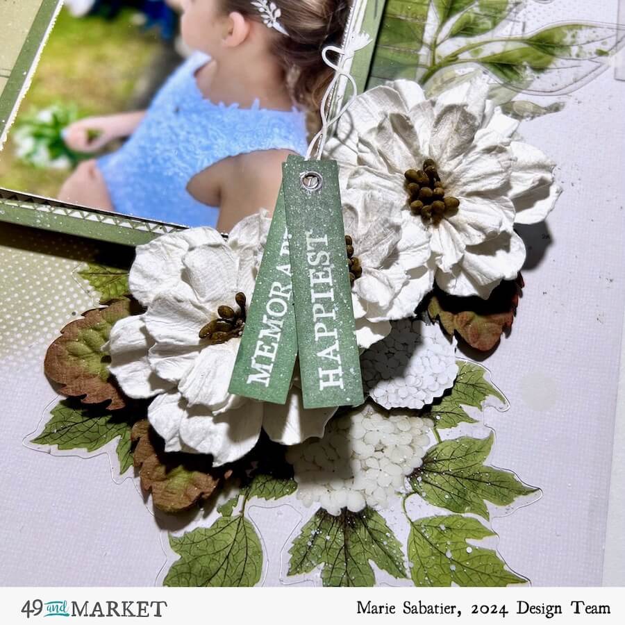
Using these beautiful white flowers “natures-bounty-salt”, I make a bouquet on which I put two labels (it is better to stick cardboard below to allow a better hold). Sometimes I like to add flowers to my layouts, they bring matter and volume.

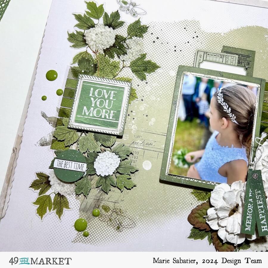
On the left side, I proceed similarly by altering the paper and the acetate. I add a ” Love You More ” label and I highlight it with a frame.

I only used white embellishments for my layout, but in the collection, there are objects with red and blue touches that will change your whole decor.
49 and Market products:
- Vintage Artistry Moonlit Garden – Ultimate Page Kit – 49 and Market
- Color Swatch Series Willow – 49 and Market
- Color Swatch Willow Laser Cut Elements – 49 and Market
- Color Swatch Willow Ephemera Stackers – 49 and Market
- Color Swatch Willow Frame Set – 49 and Market
- Color Swatch Willow Acetate Assortment – 49 and Market
- Nature’s Bounty – Salt – 49 and Market
I am convinced that this beautiful color “WILLOW” will also be a source of inspiration for you.
Marie
