Hello, and welcome back to the 49 and Market blog.
It’s Claire here today and I have a new layout to share using the Academia collection! I am obsessed with this gorgeous collection, and had so much fun creating this page.
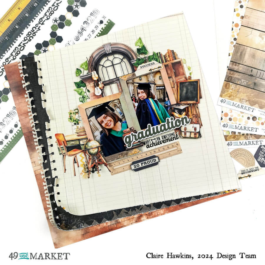
To begin, I pulled three papers from the 12×12 Collection Pack. My base layer has a brick wall pattern, which always makes me think of School kids in a playground so I thought it would be the perfect backdrop for my layout.
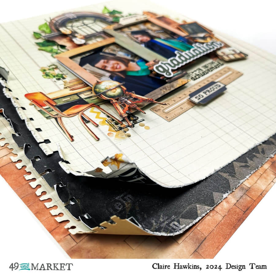
On top of this, I lay 2 pieces of patterned paper, offsetting them to mimic a stack of papers. To add to this effect, I punched the edge of each sheet with a notebook punch and distressed the edges for extra texture. I also added a notebook edge strip which can be found in the Laser Cut Elements. To add a bit of extra drama, I curled the edges up, in the same way you’d find on the edge of your notebook when it’s well worn.
Using two frames from the Die Cut Elements, I added foam around the edges and then adhered them to my photos. I love the depth this creates with the photos seemingly set back within each frame.
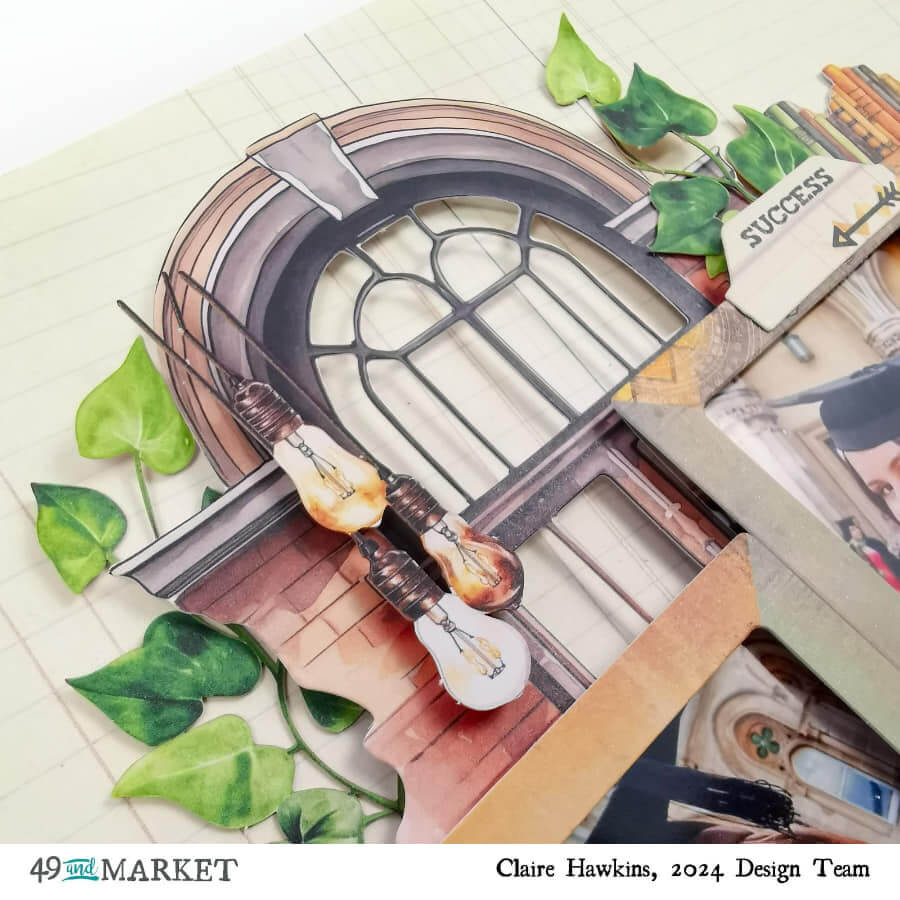
I lay these centrally on the page, building them on top of a window and bookshelf from the Die Cut Elements, and a desk, globe, chalk board, books, and graduation cap from the Laser Cut Elements. I really love the window shape as it mirrors the arches in my photographs so really helps to draw the eye in as if the page is really an extension of the pictures.
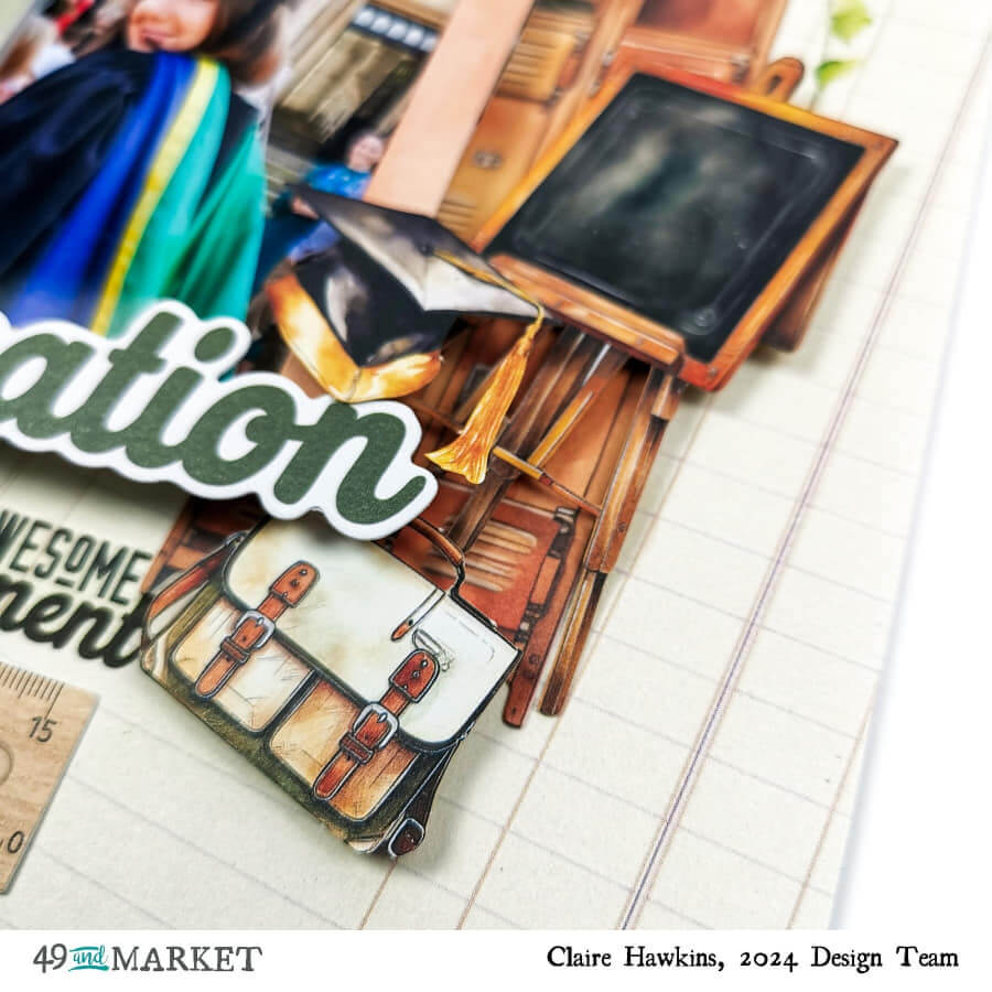
To build depth, I lay the first elements flat to the page, slowly building height by layering pieces on top of the other and adding foam for extra dimension. I really love how this helps bring the page to life.
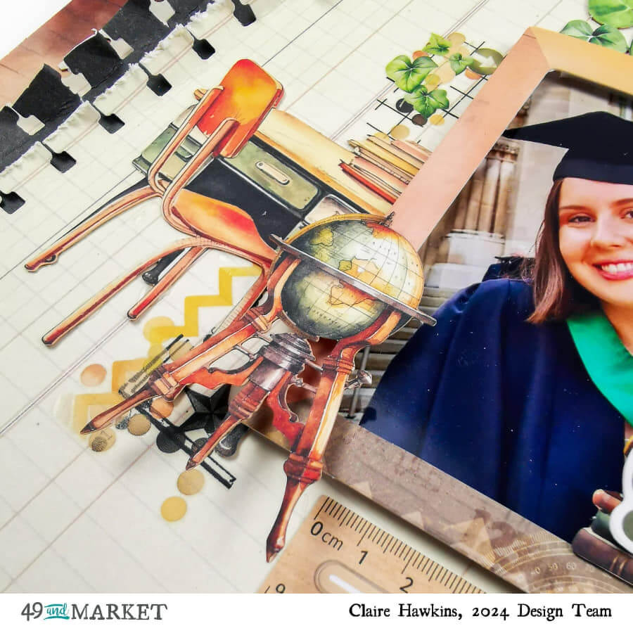
To echo the graduation theme, I chose a title from the Die Cuts and embellished a little further with a ruler, tab and label.
I also added a few Blendable rub on transfers – one just under the desk, and some leaves cascading down the side of the bookshelf. I also used them to create a small subtitle under the main Graduation title. These rub ons are such high quality and so easy to use. It’s a simple touch but elevates the page so much!
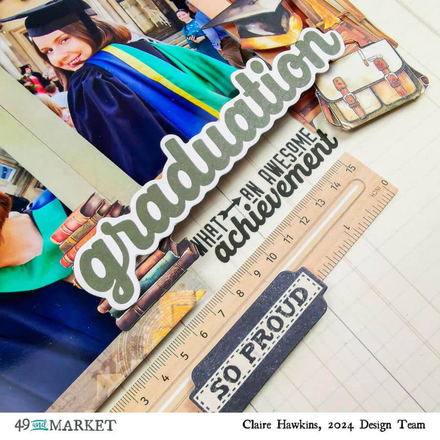
As a final touch, I added some ivy laser cuts around the window frame and a few laser cut light bulbs dangling just inside the window.
I really do adore this collection and can’t recommend it highly enough. It’s been so much fun to create with and I know it won’t be long before it’s on my desk again.
49 and Market products:
- Academia 12×12 Collection Paper Pack
- Academia Laser Cut Elements
- Academia Die Cut Elements
- Academia Blendable Rub on Transfers
I hope this layout has inspired you, and I look forward to seeing you again next month.
Happy scrapping!
Claire x
